Improving NYC.gov: A few small but significant changes DOITT should implement by January 1, 2012
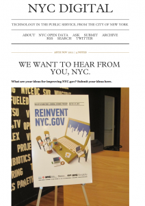
The @nycdigital Twitter account recently solicited feedback on their site redesign via Tumblr. I wanted to share my ideas but not under my Tumblr name, which is the only option through their submission form. So, I’m tweeting this post with my ideas to the DOITT team and Rachel Sterne. Hey, it worked last time!
Many UX, UI and database experts are probably going to propose a lot of bells and whistles and that’s fine — all of that is necessary. But what I’m primarily concerned about is better access to information, ASAP.
Some might argue that what I am proposing below is reactive and not taking the full redesign into consideration. True dat, I’m being reactive. My point is that — understanding how slow government usually moves — these are some relatively small but significant changes that would cost very little to make by January 1, 2012, with a high ROI.
NYC.gov needs an overhaul and that will take time.
That’s OK. In the interim, here are four small changes to the NYC.gov homepage that DOITT could implement by end of December that would improve the lives of millions.
1. Improve Community Board access on homepage and sitemap
Every NYC resident should have the contact info and calendar for their community board. This is a crucial step in a more informed, empowered population. As the Mayor’s Community Affairs Office put it, “Being a New Yorker means playing an active role in shaping your local communities, and one way to do this is to get involved with your local community board.”
Great! So why aren’t more people involved with their community board? Probably because many can’t find it. True, there is already a community board landing page but it’s not easy to find at all. This is the direct link to that page: http://www.nyc.gov/html/cau/html/cb/cb.shtml
However, if you try to search NYC.gov for “community board” you get over 2,000 irrelevant results. “Community Board” (if the person even knew what that was or how it worked) is what the average user would search for. However, if you search for “FIND YOUR community board” the CAU landing page does appear in the first page of results. But more than likely no one is searching for “find YOUR community board.”
If you search Google for “nyc find my community board,” the CAU landing page DOES appear. Great! NYC.gov should follow suit and — in addition to adding Community Board to the sitemap — change the metadata for the community board landing page to include “find my community board” as a self-directed search term.
I will give the sitemap structure credit in that it does have a “Community Groups” category and if you click on that there are some community board-related links, but that doesn’t currently include the “Find Your Community Board” landing page.
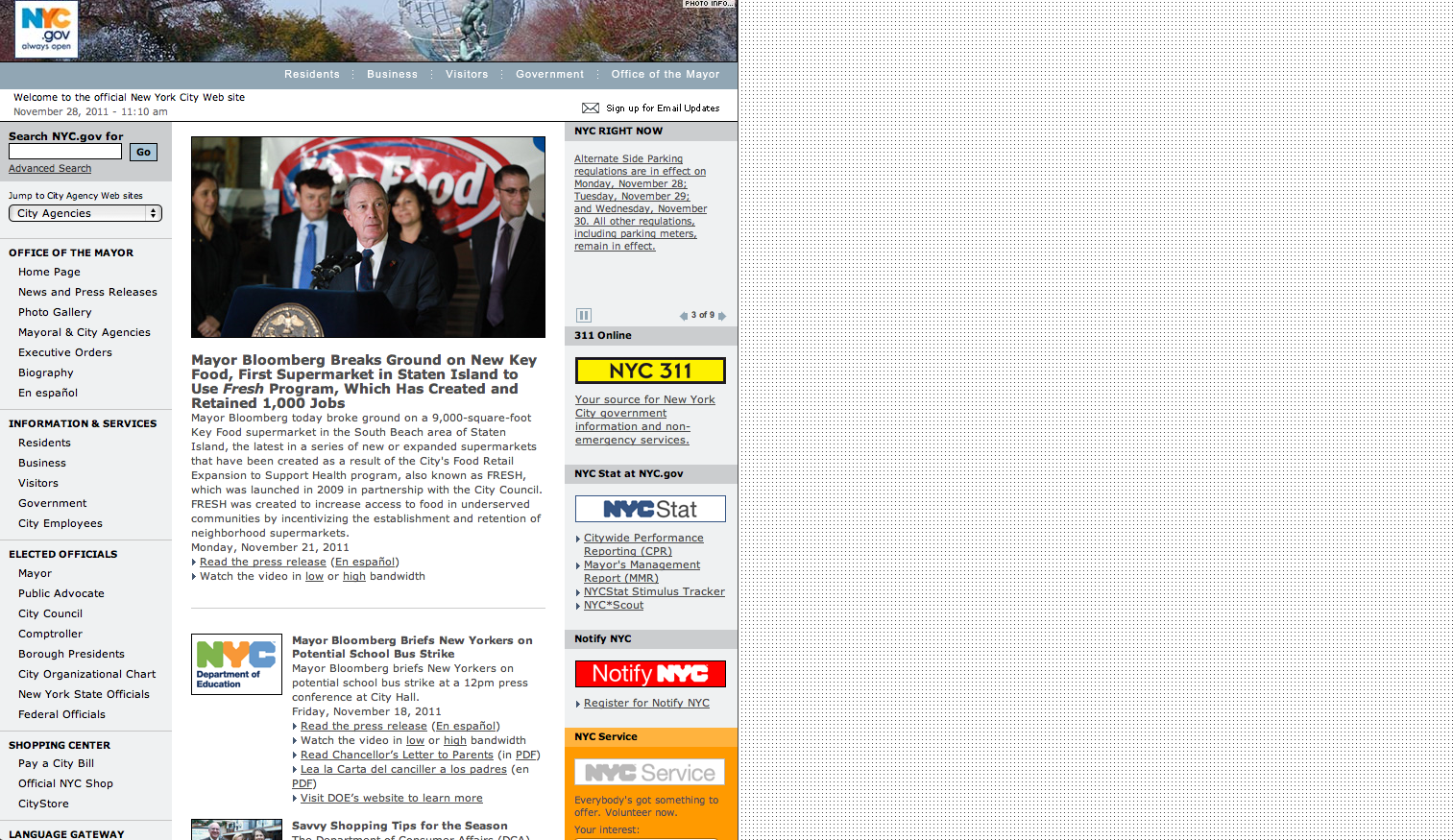
In addition to an update to the sitemap, quick access to Community Board information should be one click away on the NYC.gov homepage. In the right rail of the homepage there are several modules with useful info. Why not reduce the amount of “DID YOU KNOW” items and add another module (above the fold) that is a standing promo/search tool for Community Board information, allowing you to find info by zip code? You could put it between “Notify NYC” and “NYC Service.”
If DOITT wanted to take it one step further, they could add a tab on the Mayor’s Community Affairs Unit Facebook page that included all the community board contact info for NYC. The CAU Facebook page is what is being promoted on the “Find Your Community Board” landing page, so it would be helpful if following the CAU Facebook page gave you additional info about Community Boards.
2. Clean up NYC.gov metadata and source code content
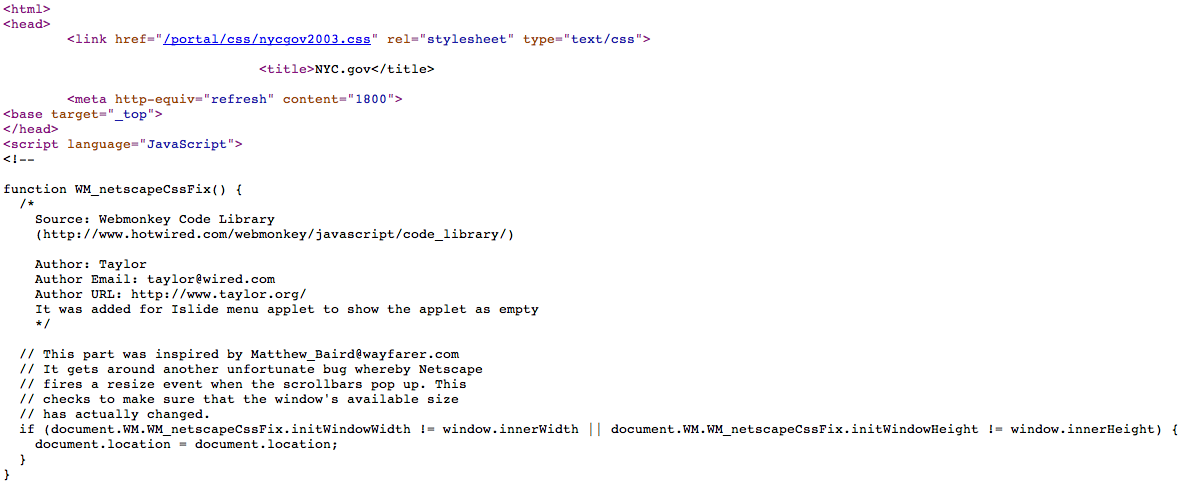
This is tied to my first suggestion re: improving search results as well as setting a tone/standard. NYC.gov needs better metadata in general, including multiple descriptions and keywords. DOITT will know what I’m talking about but for the rest of you, here’s an exercise. Try looking up NYC.gov’s source code. Just go to your nav bar on your Chrome browser and look under view>developer>view source or the equivalent for your preferred browser. You’re going to see a lot of weirdness in NYC.gov’s source code, such as old workarounds for Netscape. I think it’s time to clean house. Your source code is like your bathroom cabinet. You want to keep that tidy for guests.
Here’s an example:
MTV News’ metadata:
MTV News’ metadata includes a great description, relevant keywords and the RSS feed. You might be thinking, “well, that’s an entertainment site. This isn’t relevant.” Uh, yes it is. But in case you need more evidence, here’s CA.gov’s metadata:
Again, CA.gov includes a description and relevant keywords. Now, look at NYC.gov’s metadata:
No description or keywords to be found. If you look further down, there is more detail about a Netscape bug fix found in the WebMonkey code library than about NYC.gov itself.
The importance of cleaning up government website source code aside, updated NYC.gov metadata is an easy and necessary fix. Why? Meta elements such as descriptions and tags are like breadcrumbs for search engines and play a role in search engine optimization (SEO). Although meta elements aren’t as important as they used to be, they still give you more control over the details that search engines scrape for your search results. Bottom line, NYC.gov needs updated metadata and DOITT should be looking at/cleaning up the source code as part of the bigger picture to determine how valuable it is to rely on old scripts and workarounds moving forward.
3. Make voter registration/voting info easier to find
My “The X-Files” fueled mind often wonders if all government websites intentionally make voting information difficult to find. Hahah! Crazy, right? Anyway, NYC.gov is no exception. Currently, if you search the NYC.gov homepage, there are ZERO text links for “voting,” “voter,” or “vote.” No bueno, El Bloombito! Democracy without voting is like chips without salsa!
All joking aside, making voting info easier to find on the NYC.gov homepage by January 1, 2012, would be a minor, low-cost and incredibly helpful change.
Under the “Information & Services” module in the left rail, DOITT could add a text link called “Voting Resources” to the Board of Elections landing page: http://www.vote.nyc.ny.us/. The Board of Elections should also have an official Facebook page by January 1, 2012, which should be added to the NYC.gov social media landing page.
4. Make rich media content easier to view by increasing homepage width
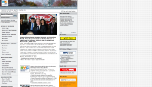
The current NYC.gov homepage uses about 50% of the average monitor width. As a result, content is bunched over to the left in all browsers and only a small portion of the content is visible above the fold. You have to scroll down quite a bit to view all the other content. There is no need for this that I can determine, aside from considering viewing through a mobile browser.
Before I go off on mobile options (I get into that further in this post), let me stick to my point: By doubling the homepage layout width and implementing a few minor design changes, visitors could access a ton of information at a much faster rate before the end of the 2011.
UI/UX changes require a lot of effort and planning, true dat. But widening the homepage wouldn’t require new features. It would simply require a few minor but significant design enhancements such as larger fonts, re-organizing the nav bar and enlarging the icons and changing the default promo layout from one major update with an image to two updates, side by side in the center rail, with the other updates running below them. This would give the site the illusion that it is frequently updated and provide more incentive to click through to additional content.
Most web developers using the coding languages that NYC.gov utilizes make their sites between 980 and 990 pixels wide. Even if DOITT just centered the homepage and placed rotating city images in the gutters (that would be pretty), that would look better and be easier to navigate than having everything bunched to the left in a width of approximately 700-800 pixels.
Additionally, the “STAY CONNECTED” module should also be placed above the fold, as well as a social plugin so visitors can “Like” the NYC.gov homepage tied to an NYC.gov Facebook page (so that when visitors leave after “liking”, NYC.gov follows them to their news feed).
Big changes for 2012
Now that I’ve shared four minor but significant fixes that could be implemented by January 1, 2012, here are my four long-term improvements that I recommend DOITT addresses by the end of 2012:
1. CMS upgrade
Judging from source code details such as what drives the NYC RIGHT NOW paginated promo module (a dhtml script taken from www.dynamicdrive.com — you can manually configure the variables to change the style of the scroller and the content in it), NYC.gov needs a more robust and integrated content management system that includes scheduling tools. 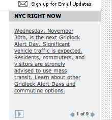
Additionally, content IDs and other CMS data org features allow you to hide privileged info while making it easier to update the site with fewer mistakes. This is tied to site infrastructure so this isn’t a “fix” that could realistically happen by January 1, 2012, but I hope DOITT considers minimizing how much content is hand coded/updated on the site throughout the day by implementing and customizing an off-the-shelf or proprietary CMS.
If DOITT ever plans to implement more interactive content (see my suggestions below), they will need a CMS infrastructure that supports those features. From what I can tell so far, the existing CMS does not support anything beyond standard JavaScript and CSS tweaks — hacks that you don’t want site producers accidentally breaking.
2. Make content immersive and all-screens friendly using HTML5
DOITT will know what I’m talking about, but for others, it’s crucial for all web portals to be relevant on all screens. This means that if you are looking at a homepage on a phone, or an iPad, or your desktop computer, the content should scale to that device so you can easily find what you’re looking for. That is the bare minimum benefit of using HTML5 — making websites that easily recognize how they are being viewed and adjust accordingly.
Beyond that, NYC.gov should use HTML5 to create more immersive web content that creates tactile experiences, empowering the user to navigate and manipulate data through their touch screen devices. DOITT could take a page from The Boston Globe and identify relevant content such as from NYC Open Data to visually share information through touchscreen interfaces for infographics, timelines, polling/survey mechanisms and more.
NYC Digital is on a mission to attract more tech investors and startups to NYC. These are terrific goals that will insure that NYC remains a place that millions flock to for work, education and inspiration.
However, NYC.gov isn’t just a website that helps to promote these goals (as I’ve noted are the most common updates to the homepage — Bloomberg announcing various tech/industry partnerships). NYC.gov is a UTILITY that needs to be USEFUL for the people who live and pay taxes. DOITT needs to make it easier for citizens to find what they are looking for on the website, no matter where they are and through all devices.
3. Enable frictionless sharing of NYC.gov content
Here’s a scenario: Let’s say I’ve already opted into NYC.gov frictionless sharing. I’m reading a press release on NYC.gov and that activity shoots to my Facebook news feed. Zoom! Pow! I’ve magically become a PR rep for NYC.gov. I’m instantly an ambassador for government knowledge. All my friends can see that I’m on the site and at least a few of them may click on the link.
As of right now, NYC.gov doesn’t allow frictionless sharing on their press releases, let alone other valuable content. There is an almost translucent “share” button with the usual list of social plugins and if you click the Facebook option it sends you to yet another screen alerting you to the fact that you are now leaving NYC.gov. Duh, I know that!
Can we lose that “you are now leaving” notification, please? I don’t believe it’s a requirement on government websites when you link off-site to an official social media channel. I’ve checked several government websites and this isn’t standard practice.
Also, the suite of sharing plugins should be (and can be added easily at no additional cost) on each piece of content. What if I just want to “Like” something immediately or tweet it — not recommend or share with a comment? What if I don’t even want to bother with sharing the link but am OK with my activity appearing in my newsfeed? What if I want to G+ it up? Right now, I can’t.
With the heavy social media push happening in NYC government (which I’m ecstatic about, btw) and security factors aside, frictionless sharing on NYC.gov seems like a logical step.
4. Opinions are like assholes. Everyone has one…
…And some stink more than others! With that in mind, moderated chatter on a government website is not something to fear. It should be embraced, and in the middle of that love fest should be real-time interactive tools like Cover It Live and Livefyre so that visiting NYC.gov doesn’t have to be a solitary experience (when you don’t want it to be)! Imagine this: Democracy in action, within the comments on NYC.gov. If you build it, they will come — all the freaks, conspiracy theorists and nutballs — plus folks who are passionate about improving the world, like me. It’s a mixed bag and a moderation policy and support team would be necessary, but it would be worth it.
Bare minimum, NYC.gov should implement Disqus to manage (and provide the option of) commenting on all press releases and news articles. Whether you agree with the noise or not, being able to share a salient comment broadens exposure to the topic and offers the opportunity to respond.
Thanks for taking the time to read my suggestions, DOITT and Rachel Sterne! I wrote this in a cheeky manner so it was less boring to read. I am in no way belittling your ongoing efforts and all the time and planning already in progress. Thanks for everything you do to make government more accessible to citizens, because without the people involved it’s not a real government at all.
Let me know what you think by leaving a comment and I’ll respond.
